Valtio
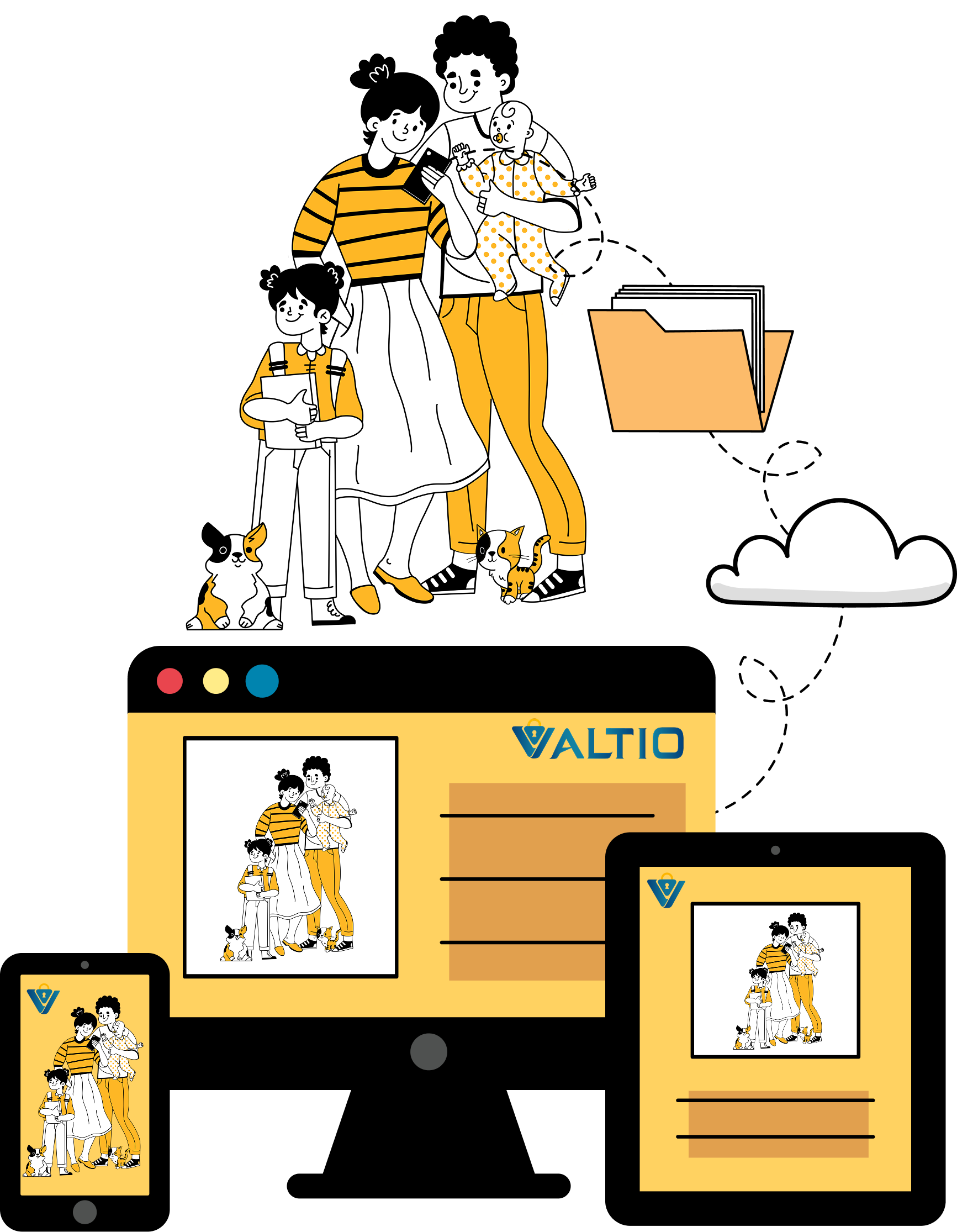
Custom illustration and refreshed UI
The Ask
Valitio's website no longer reflected the quality of its services. The experience felt dated, difficult to navigate, and relied on generic visuals that made it harder for potential customers to understand and trust the brand.
Design Goals
Based on the research findings, the following design goals were established for the website redesign:
Simplify the Experience:Create a cleaner interface with improved navigation and visual hierarchy so users can quickly understand Valitio's services.Strengthen the Brand:Replace generic visuals with custom illustrations and a cohesive visual identity that better reflects Valitio's personality.Modernize the Experience:Refresh the interface with contemporary UI patterns, improved spacing, and a more approachable user experience.

Conclusion
A thoughtful redesign can completely shift how users feel inside a digital experience. By simplifying the interface, refreshing the visual identity, and adding custom illustrations, I helped Valtio communicate its services with clarity and confidence. The final design feels warmer, friendlier, and more trustworthy, bringing a human touch to an industry that often feels cold.
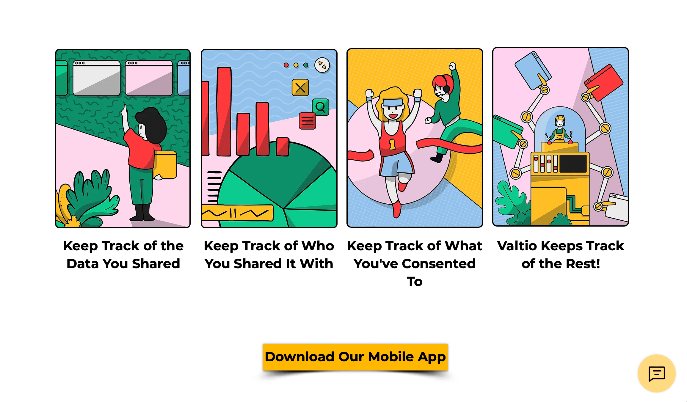
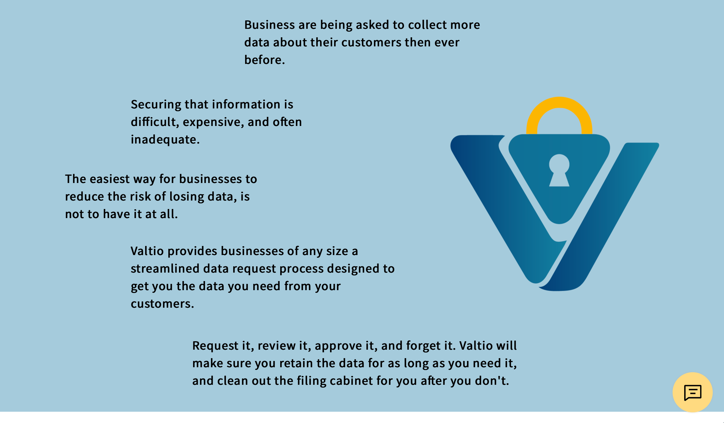
Before
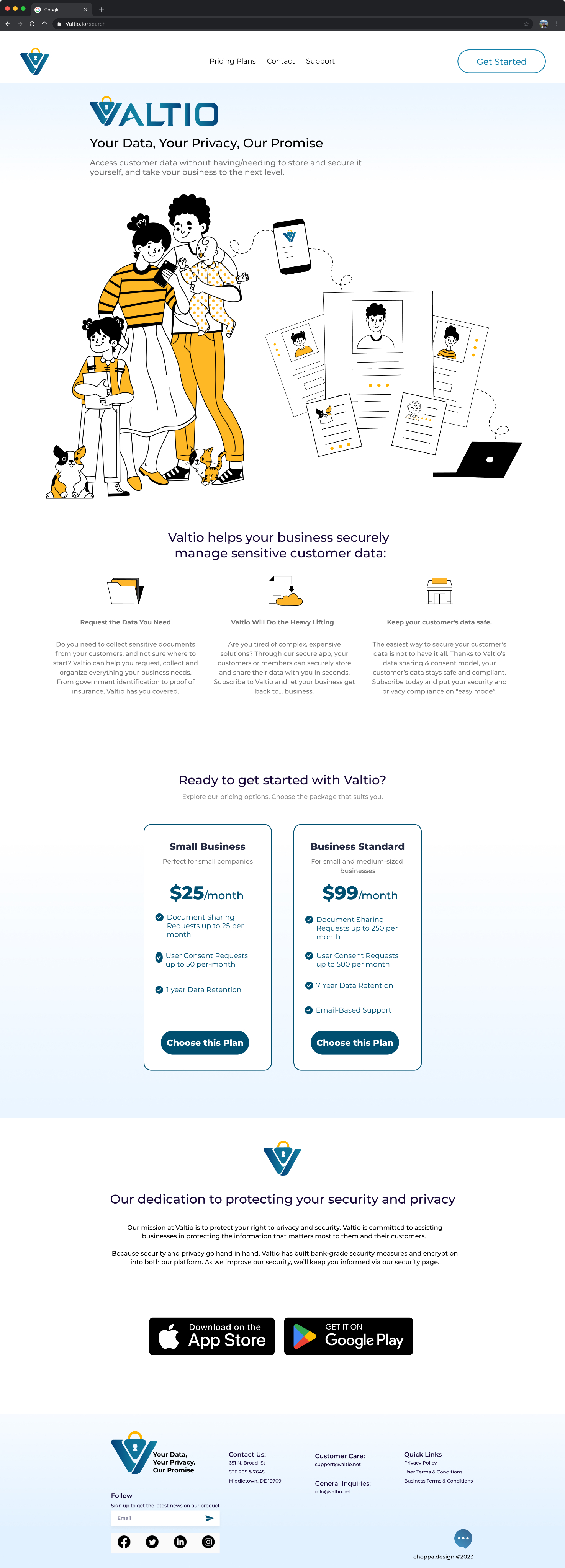
After
See It Come Together
A quick look at the redesigned homepage.
Watch the Walkthrough


Follow Me


Email me
mciappa.art@gmail.com
©2026
Research, Analysis, and Key Findings
Through a content and usability review, I found three recurring issues that shaped the direction of the redesign. I evaluated the site's layout, navigation, typography, visual hierarchy, and content structure to understand what was working and what needed improvement. I also reviewed comparable financial technology websites to identify common UX patterns, visual trends, and opportunities to create a more approachable and trustworthy experience.

Complicated Interface
The interface felt cluttered and inconsistent, making it difficult for users to find what they needed.

Lack of Visual Appeal
The design relied heavily on text with minimal hierarchy and little visual interest. This created friction and made the experience feel outdated.

Generic Clip Art & Templates
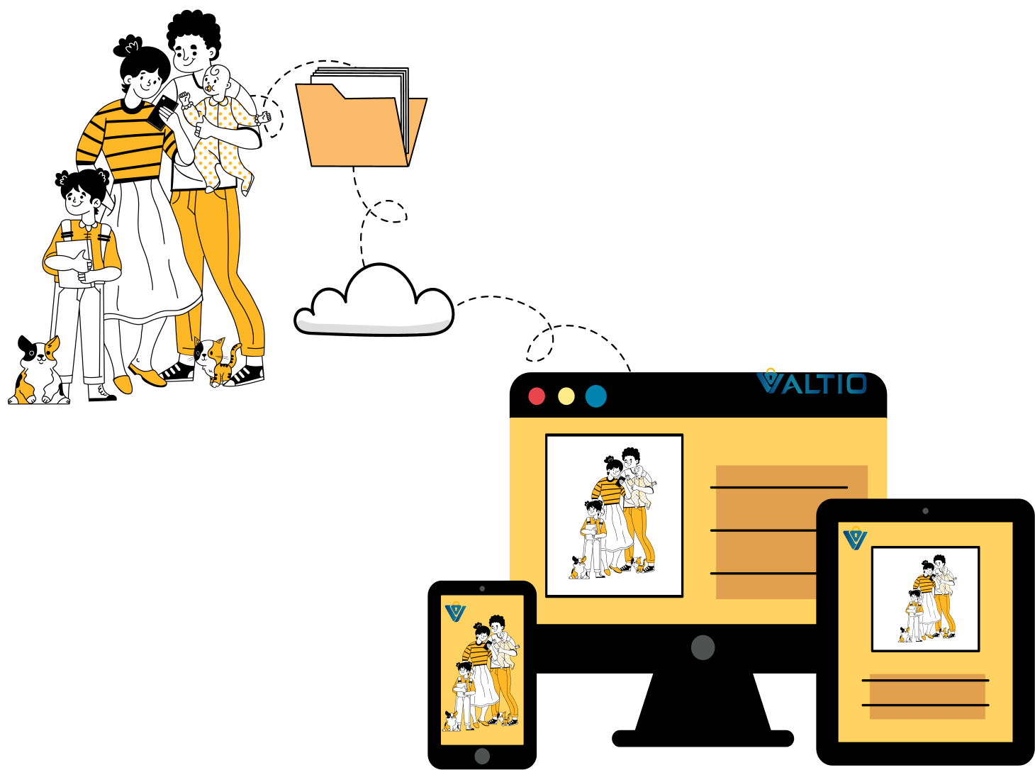
The site used generic, out of the box illustrations that lacked personality and didn’t reflect the brand, making the experience feel dated and disconnected.
choppa.design

Where whimsy meets wireframes.

Valtio
Custom illustration and refreshed UI
The Ask
Valitio's website no longer reflected the quality of its services. The experience felt dated, difficult to navigate, and relied on generic visuals that made it harder for potential customers to understand and trust the brand.
Design Goals
Based on the research findings, the following design goals were established for the website redesign:
Simplify the Experience:Create a cleaner interface with improved navigation and visual hierarchy so users can quickly understand Valitio's services.Strengthen the Brand:Replace generic visuals with custom illustrations and a cohesive visual identity that better reflects Valitio's personality.Modernize the Experience:Refresh the interface with contemporary UI patterns, improved spacing, and a more approachable user experience.
Conclusion
A thoughtful redesign can completely shift how users feel inside a digital experience. By simplifying the interface, refreshing the visual identity, and adding custom illustrations, I helped Valtio communicate its services with clarity and confidence. The final design feels warmer, friendlier, and more trustworthy, bringing a human touch to an industry that often feels cold.
Before
After
See It Come Together
A quick look at the redesigned homepage.
Watch the Walkthrough
Follow Me
Email me
mciappa.art@gmail.com
©2026
Research, Analysis, and Key Findings
Through a content and usability review, I found three recurring issues that shaped the direction of the redesign. I evaluated the site's layout, navigation, typography, visual hierarchy, and content structure to understand what was working and what needed improvement. I also reviewed comparable financial technology websites to identify common UX patterns, visual trends, and opportunities to create a more approachable and trustworthy experience.
Complicated Interface
The interface felt cluttered and inconsistent, making it difficult for users to find what they needed.

Lack of Visual Appeal
The design relied heavily on text with minimal hierarchy and little visual interest. This created friction and made the experience feel outdated.
Generic Clip Art & Templates
The site used generic, out of the box illustrations that lacked personality and didn’t reflect the brand, making the experience feel dated and disconnected.
choppa.design

Where whimsy meets wireframes.
Contact

Valtio
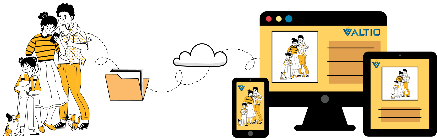
Custom illustration and refreshed UI
The Ask
Valitio's website no longer reflected the quality of its services. The experience felt dated, difficult to navigate, and relied on generic visuals that made it harder for potential customers to understand and trust the brand.
Design Goals
Based on the research findings, the following design goals were established for the website redesign:
Simplify the Experience:Create a cleaner interface with improved navigation and visual hierarchy so users can quickly understand Valitio's services.Strengthen the Brand:Replace generic visuals with custom illustrations and a cohesive visual identity that better reflects Valitio's personality.Modernize the Experience:Refresh the interface with contemporary UI patterns, improved spacing, and a more approachable user experience.
Conclusion
A thoughtful redesign can completely shift how users feel inside a digital experience. By simplifying the interface, refreshing the visual identity, and adding custom illustrations, I helped Valtio communicate its services with clarity and confidence. The final design feels warmer, friendlier, and more trustworthy, bringing a human touch to an industry that often feels cold.
Before
After
See It Come Together
A quick look at the redesigned homepage.
Watch the Walkthrough
Follow Me
Email me
mciappa.art@gmail.com
©2026
Research, Analysis, and Key Findings
Through a content and usability review, I found three recurring issues that shaped the direction of the redesign. I evaluated the site's layout, navigation, typography, visual hierarchy, and content structure to understand what was working and what needed improvement. I also reviewed comparable financial technology websites to identify common UX patterns, visual trends, and opportunities to create a more approachable and trustworthy experience.
Complicated Interface
The interface felt cluttered and inconsistent, making it difficult for users to find what they needed.

Lack of Visual Appeal
The design relied heavily on text with minimal hierarchy and little visual interest. This created friction and made the experience feel outdated.
Generic Clip Art & Templates
The site used generic, out of the box illustrations that lacked personality and didn’t reflect the brand, making the experience feel dated and disconnected.