The Ask
Valtio.io is a website that provides comprehensive solutions for managing financial operations and transactions. As a designer, I was tasked with redesigning the website to make it more visually appealing, simpler to navigate, and to incorporate modern assets, particularly illustrations, in order to enhance the overall user experience.
Research and Analysis:
To begin the redesign process, I conducted a thorough analysis of the existing Valtio.io website. I examined its overall structure, layout, color scheme, typography, and content organization. I also analyzed competitor websites in the financial technology industry to gain insights into current design trends and user expectations.
Key Findings
Complex Interface:
The existing website had a cluttered interface all on one page, making it challenging for users to find relevant information quickly.
Lack of Visual Appeal:
The website lacked engaging visuals, relying mostly on stock images and generic graphics, which resulted in a dull and impersonal user experience.
Inconsistent Branding:
The color palette and typography did not align with Valtio.io's branding, creating a disjointed visual identity.
Design Goals:
Based on the research findings, the following design goals were established for the website redesign:
Simplicity:
Simplify the interface and streamline the navigation to improve usability and reduce cognitive load for users.
Modernization:
Integrate contemporary design elements and assets to give the website a fresh and up-to-date look.
Friendliness:
Create a warm and approachable visual tone to make users feel welcome and comfortable while navigating the website.
Design Approach:
To achieve the desired goals, I employed the following strategies:
Simplified Navigation:
I restructured the website's information architecture, grouping related content together and implementing a clear and intuitive navigation menu that allowed users to access desired information with ease.
Minimalistic Layout:
I opted for a clean and spacious layout, using ample whitespace to enhance readability and highlight key information.
Modern Assets:
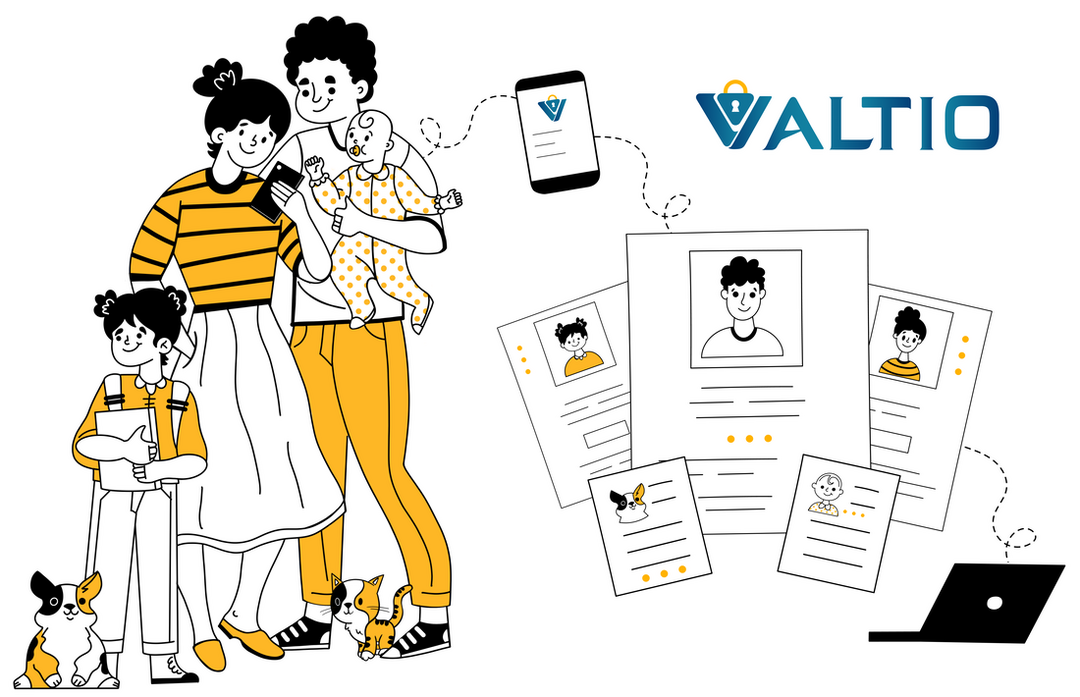
I introduced custom illustrations throughout the website to add visual interest and a human touch. These illustrations would serve as a key design element, reinforcing Valtio.io's brand personality and making complex financial concepts more approachable.
Results and Evaluation:
The redesigned Valtio.io website successfully achieved the set design goals:
Simplified Interface:
The streamlined navigation and organized content structure significantly improved the overall user experience by allowing users to find information quickly and easily.
Modern Visual Appeal:
The inclusion of custom illustrations and contemporary design elements added a visually appealing and engaging aspect to the website, making it more appealing to users.
Friendly and Approachable Tone:
The new design, characterized by warm and inviting illustrations, created a friendlier and more approachable atmosphere, enhancing user engagement and establishing a stronger emotional connection.
Conclusion:
Through a strategic redesign process focused on simplicity, modernization, and the integration of custom illustrations, the Valtio.io website has undergone a transformation that aligns with the company's goals of providing a user-friendly and visually appealing platform for financial management. The redesign successfully addresses the previous limitations of the website, resulting in improved user experience and increased user engagement.


