Confidentiality Note
To protect confidentiality, branding and client details have been recreated for this portfolio. The work shown reflects my design process and contributions.
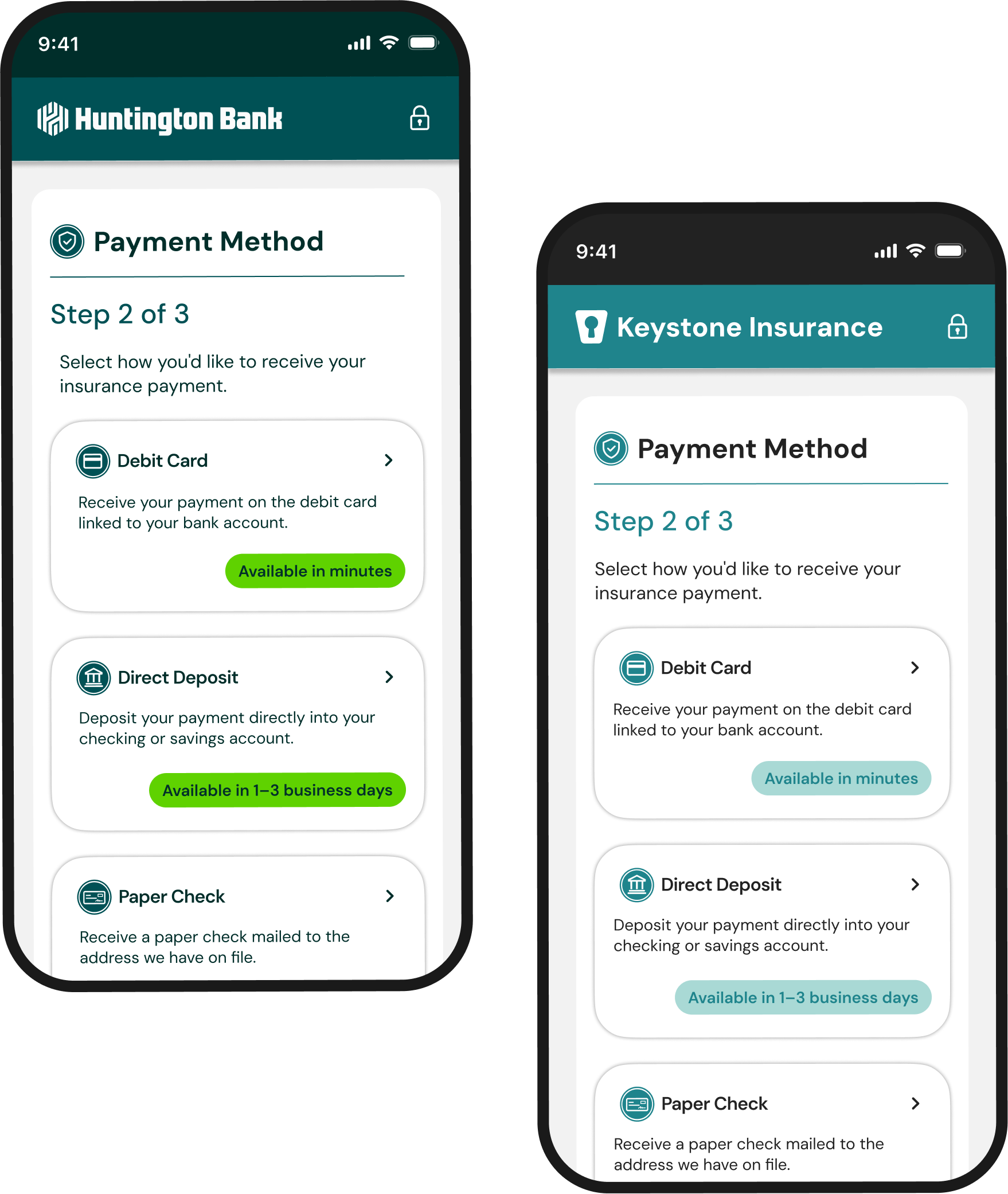
Goals

Business Goals
- Reduce paper check usage
- Increase digital payment adoption
- Support multiple organizations

Platform Goals
- Configurable • Accessible
- Responsive • Scalable

User Goals
- Receive payments faster
- Choose a preferred payment method
- Build trust through secure interactions
The Problem
Organizations needed a digital payment experience that felt simple for payees while remaining flexible enough to support different industries and business needs.
The challenge wasn't designing one payment flow. It was creating a scalable platform that could adapt to many organizations without sacrificing usability.

PAPER CHECKS
Slow • Expensive
Inflexible


DIGITAL DISBURSEMENTS
Secure • Fast
Flexible
Responsibilities

Lead UX
Visual Designer

Timeline
6 Months

Company
Huntington Bank

Team
PM, UX, Dev,
Accessibility

Platform
Responsive Web
Platform
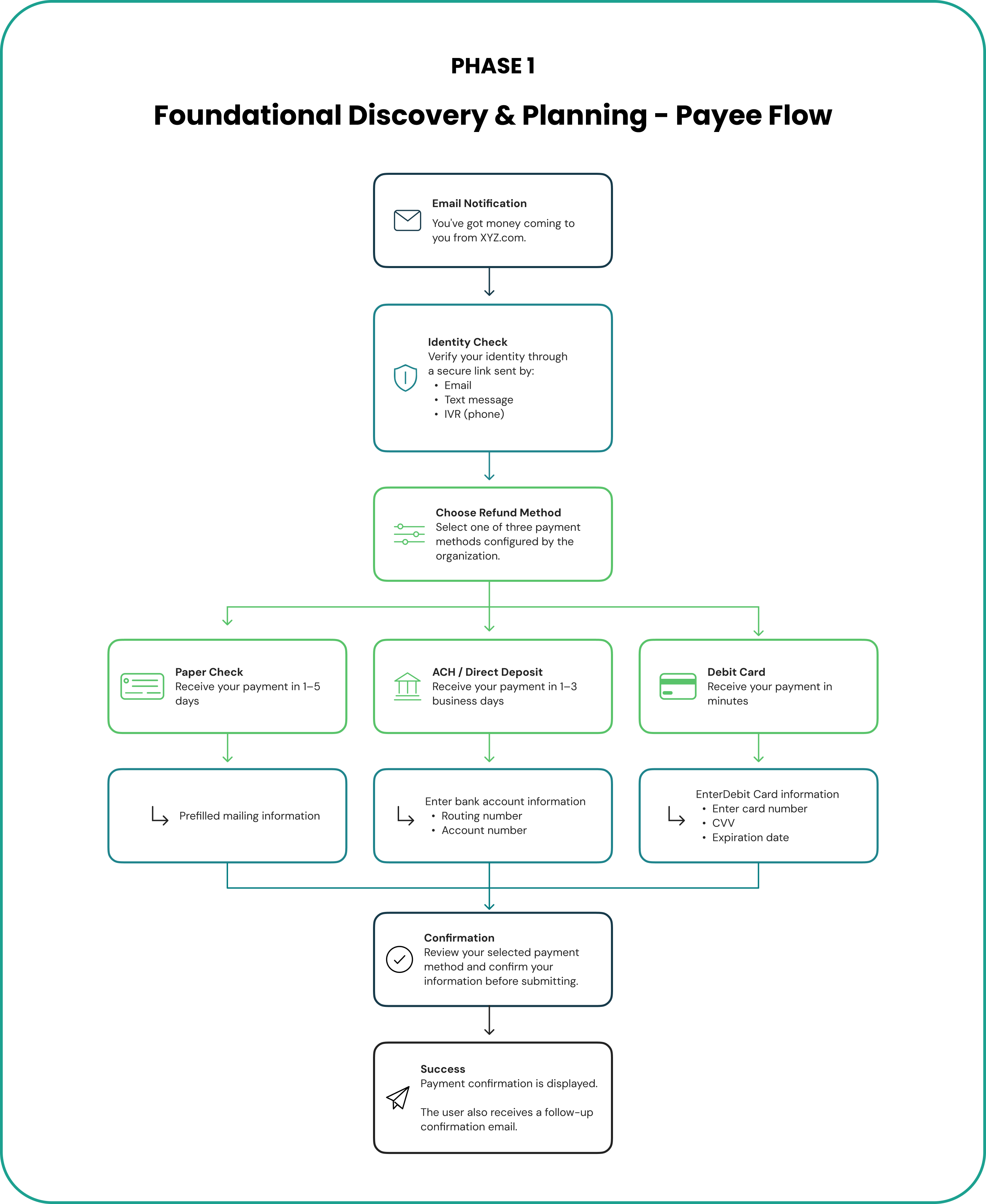
Discovery & Planning
Mapping the Platform
We partnered with product and engineering to map a configurable payment platform that could support multiple organizations while maintaining one shared experience.
What We Learned
- One core journey supported multiple industries.
- Clear guidance mattered more than fewer steps.
- Configuration scaled better than customization.
Early Exploration
Early concepts explored different ways to guide users through payment selection while creating a flexible experience that could scale across multiple clients.
What We Explored:
- Information hierarchy
- Screen progression
- Payment selection patterns
- Responsive layouts
- Form organization
Although the final product evolved significantly, sketching early concepts helped validate the overall experience before building the design system.
Key Outcomes
- Simplified payment choices into guided, step-by-step decisions.
- Used progressive disclosure to reduce cognitive load.
- Refined layouts into a scalable platform pattern.
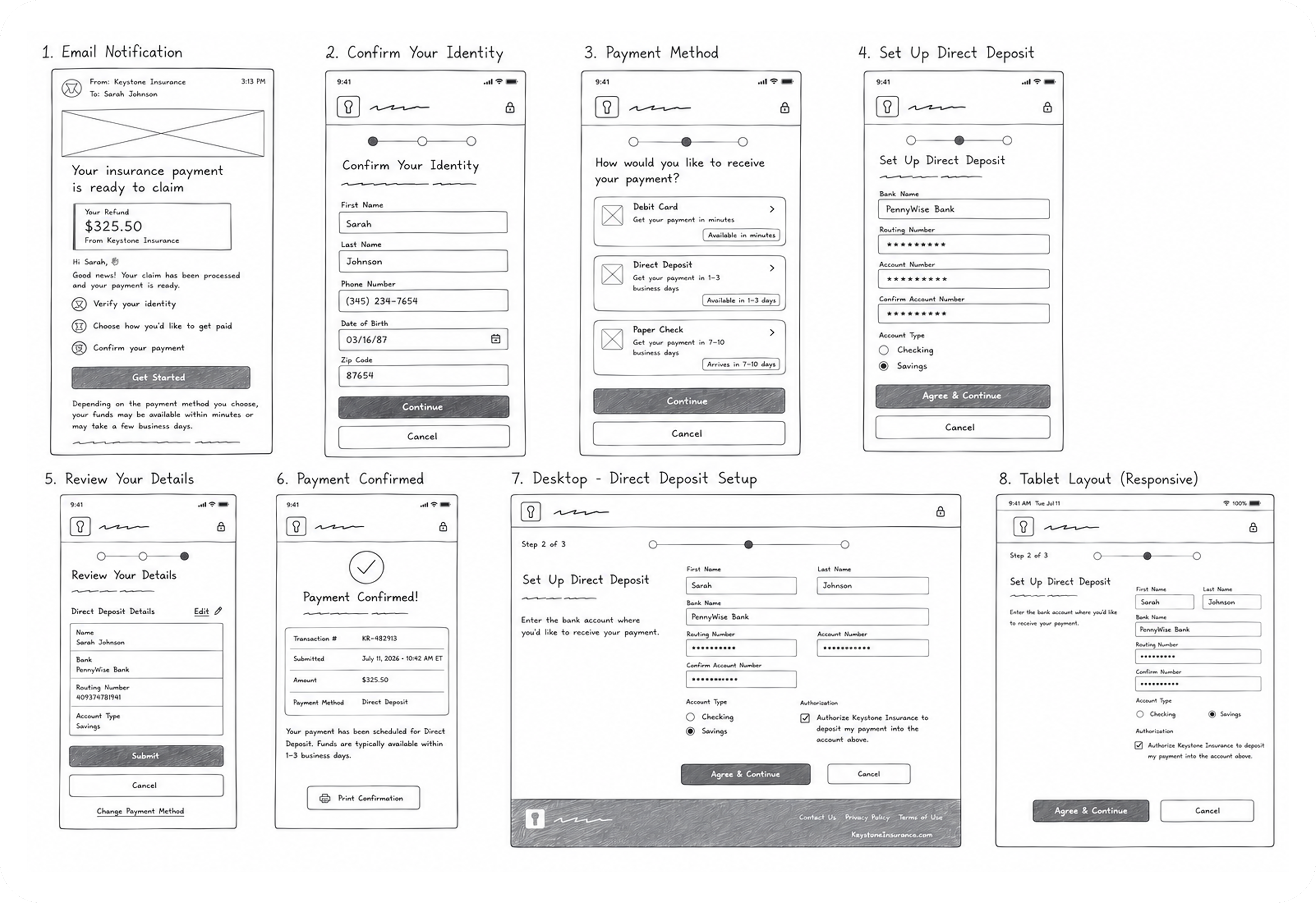
*Early concepts validated the overall flow before refining the final interaction patterns.
Guided Payment Flow
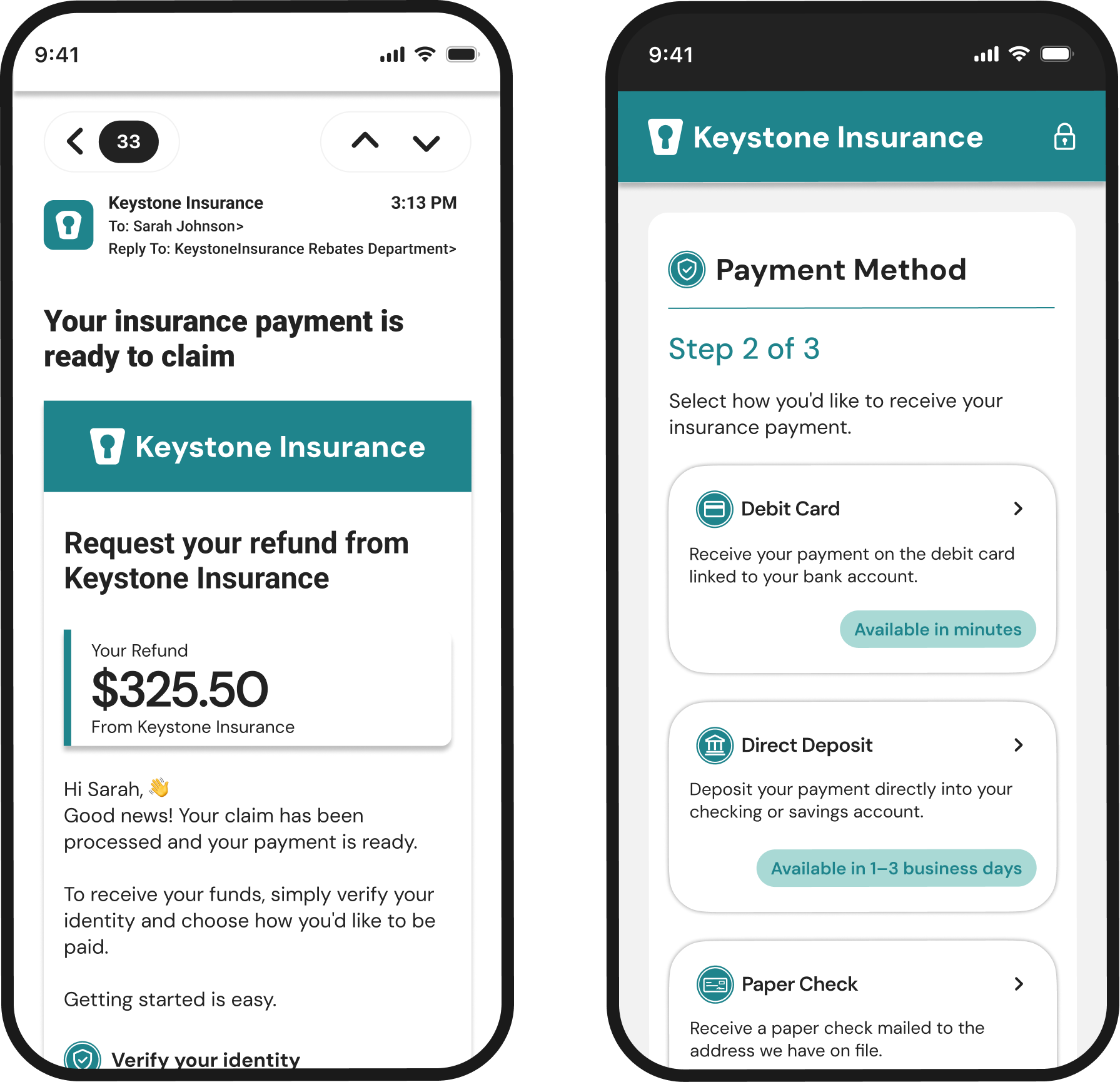
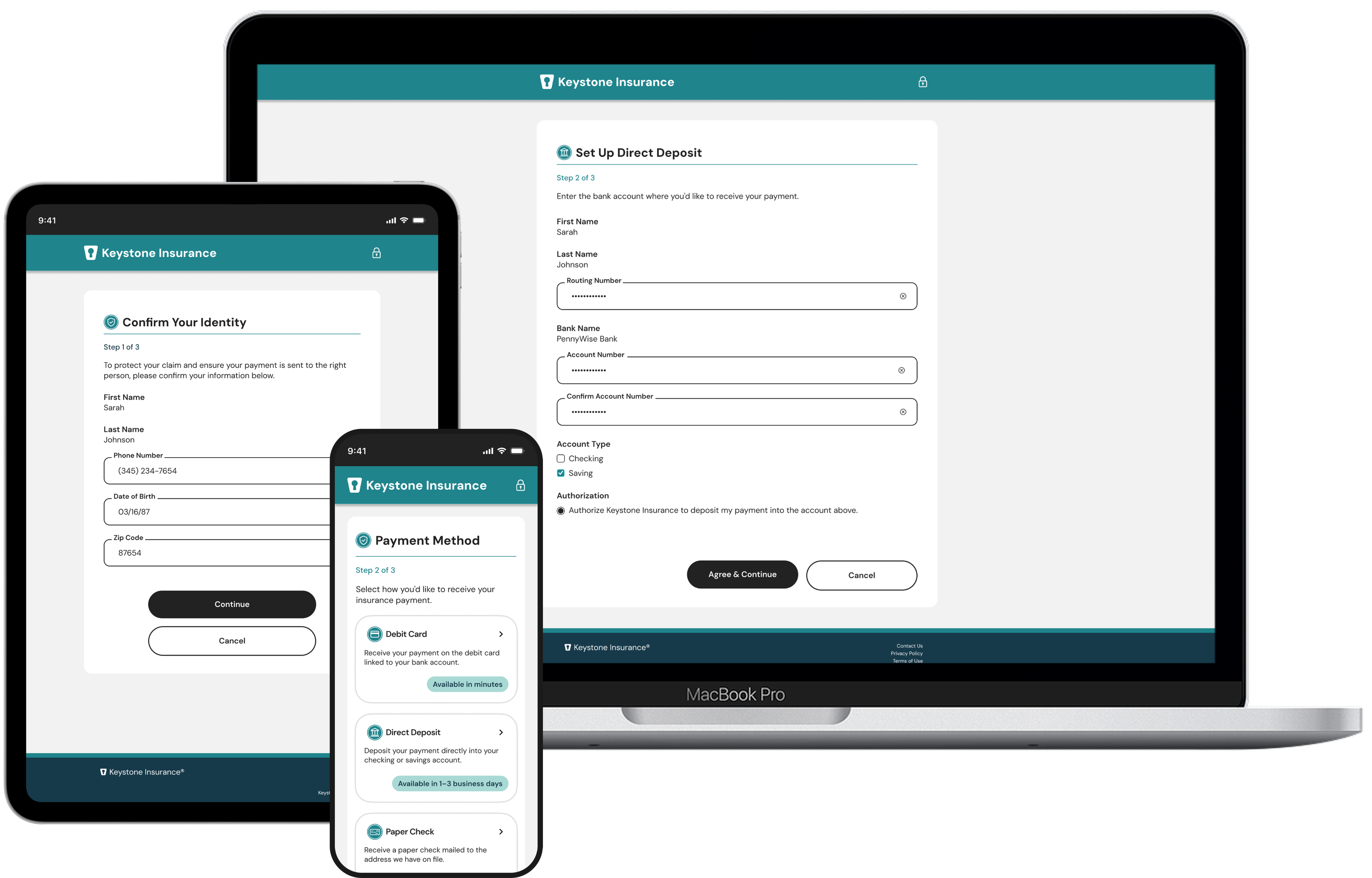
Designed one guided payment experience that could scale across organizations while remaining familiar and accessible.
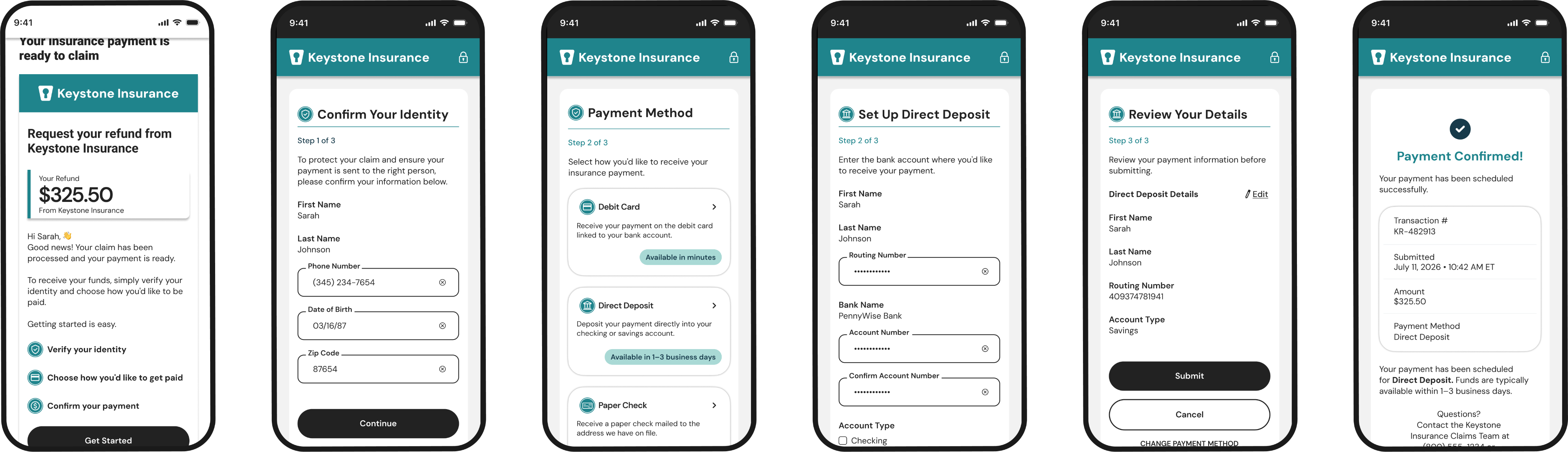
User Journey:
Verify Identity
Select a Payment Method
Review & Confirm


Design Decisions
- Guided users through smaller, manageable steps.
- Used familiar payment patterns to build confidence.
- Reduced cognitive load with progressive disclosure.

Biggest Challenge
Designing a platform flexible enough for multiple industries without sacrificing usability.

What I’m Most Proud Of
Creating a scalable design foundation that supports multiple organizations through configuration instead of redesign.

What I Learned
Designing configurable products reinforced the importance of systems thinking. Balancing user needs, accessibility, technical constraints, and business goals required close collaboration and thoughtful design decisions throughout the project.
Now experience it.
From research to a scalable platform, this project transformed digital payouts into a guided, configurable experience. Watch the prototype to see the final experience in action.


Follow Me


Email me
mciappa.art@gmail.com
©2026
Accessibility
Accessibility was considered from the beginning of the project, influencing interaction patterns, form design, navigation, and reusable components across the platform.

Designing for Accessibility
Accessibility was a core principle throughout the design process. We built the experience to be inclusive, usable, and compliant with WCAG 2.1 AA standards.

All text and interface elements meet or exceed WCAG AA contrast requirements.
WCAG-Compliant Color Contrast

All interactive elements meet the 44x44px minimum for touch accessibility.
Large Touch Targets


Typography, spacing, and layout guide users through the content in a meaningful order.
Clear Visual Hierarchy
From fields, buttons, and icons include accessible labels, states, and error handling.
Accessible From Controls

Logical tab order and visible focus states ensure smooth navigation for keyboard users.
Keyboard Accessibility

Proper headings, landmarks, and ARIA best practices support assistive technologies.
Semantic Structure

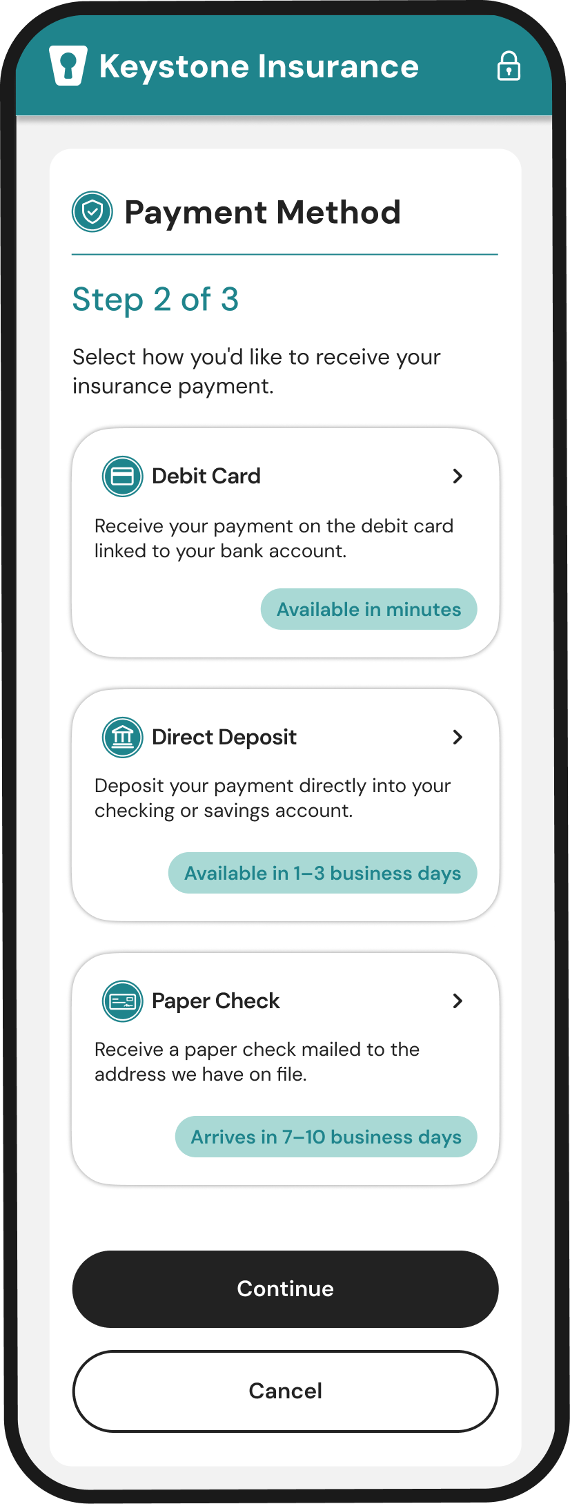


Accessibility wasn't treated as a final checklist. It influenced design decisions throughout the project, from interaction patterns to component behavior.

4.5.1 Contrast
Our color palette meets WCAG AA standards with sufficient contrast for text and interface elements.
Large Touch Targets
Button and interactive areas meet 44x44px minimum for touch accessibility.

Clear Hierarchy
Typography scale, spacing, and visual weight guide users through the content with ease.

Accessible Form Controls
Buttons, icons, and cards are built with accessible states, labels, and readable text for all users.

Keyboard Focus Order
Elements follow a logical tab order with visible focus states for easy keyboard navigation.

Supportive Content
Clear descriptions and timing information help users make informed choices.
One Platform.
Configured for Every Client.
One shared platform supported multiple organizations through configuration rather than redesign. Branding, messaging, and payment options adapted to each client while the core experience remained consistent.
How the Platform Scalest
Shared Platform
Built once. Reused across every client.

Shared Components
Built once. Used everywhere.

Consistent Layouts
Reliable patterns across all clients.

Responsive Design
Works seamlessly on every device

Accessibility Standards
WCAG compliant for all users.

Secure Interactions
Validated, accessible, and built for trust.

Scalable Architecture.
One platform. Many organizations.

Client-Specific Configuration

Displayed throughout the experience.
Logo

Applied across the interface.
Brand Colors

Configured per client.
Payment Methods

Payment terminology adapts to each client.
Payment Copy

Based on payment rails and business rules.
Timing Messages

Configured for each client.
Contact Information
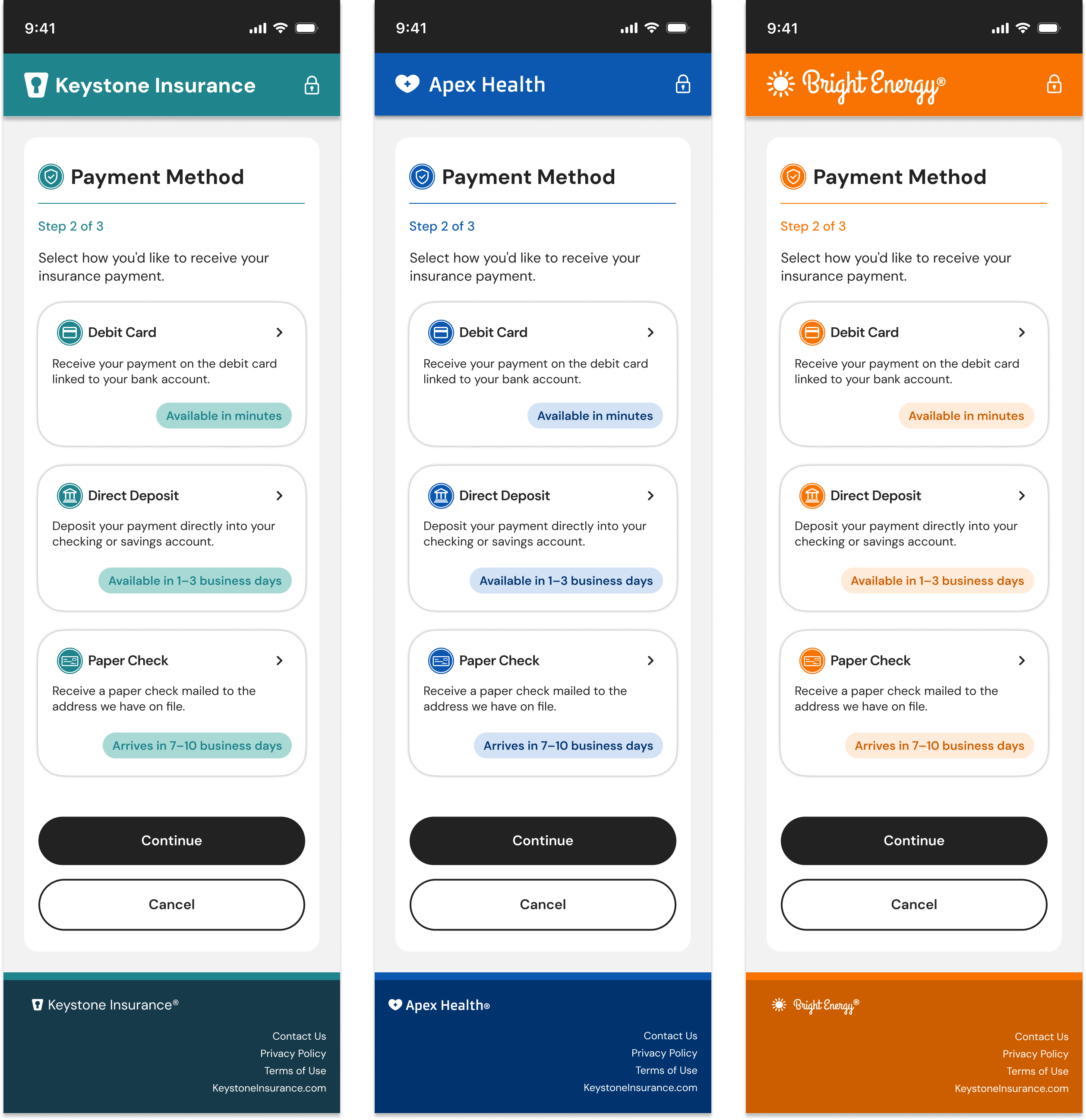
The result:
One secure platform that scales across organizations through configuration rather than redesign.
From Paper Checks to Digital Payments
Organizations could replace paper checks with a guided digital payment experience that remained consistent while adapting to each client's brand and business rules.
Digital Payout Experience
Creating a configurable payment experience that scales across multiple organizations.
choppa.design

Where whimsy meets wireframes.

Digital Payout Experience
Creating a configurable payment experience that scales across multiple organizations.
Confidentiality Note
To protect confidentiality, branding and client details have been recreated for this portfolio. The work shown reflects my design process and contributions.
Goals
Business Goals
- Reduce paper check usage
- Increase digital payment adoption
- Support multiple organizations
Platform Goals
- Configurable • Accessible
- Responsive • Scalable
User Goals
- Receive payments faster
- Choose a preferred payment method
- Build trust through secure interactions
The Problem
Organizations needed a digital payment experience that felt simple for payees while remaining flexible enough to support different industries and business needs.
The challenge wasn't designing one payment flow. It was creating a scalable platform that could adapt to many organizations without sacrificing usability.

PAPER CHECKS
Slow • Expensive • Inflexible



DIGITAL DISBURSEMENTS
Secure • Fast • Flexible
Responsibilities
Lead UX
Visual Designer
Timeline
6 Months
Company
Huntington Bank
Team
PM, UX, Dev,
Accessibility
Platform
Responsive Web
Platform
Discovery & Planning
Mapping the Platform
We partnered with product and engineering to map a configurable payment platform that could support multiple organizations while maintaining one shared experience.
What We Learned
- One core journey supported multiple industries.
- Clear guidance mattered more than fewer steps.
- Configuration scaled better than customization.
Early Exploration
Early concepts explored different ways to guide users through payment selection while creating a flexible experience that could scale across multiple clients.
What We Explored:
- Information hierarchy
- Screen progression
- Payment selection patterns
- Responsive layouts
- Form organization
Although the final product evolved significantly, sketching early concepts helped validate the overall experience before building the design system.
Key Outcomes
- Simplified payment choices into guided, step-by-step decisions.
- Used progressive disclosure to reduce cognitive load.
- Refined layouts into a scalable platform pattern.
*Early concepts validated the overall flow before refining the final interaction patterns.
From Paper Checks to Digital Payments
Organizations could replace paper checks with a guided digital payment experience that remained consistent while adapting to each client's brand and business rules.
Guided Payment Flow
Designed one guided payment experience that could scale across organizations while remaining familiar and accessible.
User Journey:
Verify Identity
Select a Payment Method
Review & Confirm


Design Decisions
- Guided users through smaller, manageable steps.
- Used familiar payment patterns to build confidence.
- Reduced cognitive load with progressive disclosure.

Biggest Challenge
Designing a platform that could adapt to multiple industries without sacrificing usability.

What I’m Most Proud Of
Creating a scalable platform that supports multiple organizations through configuration instead of redesign.

What I Learned
Designing configurable products reinforced the importance of systems thinking and cross-functional collaboration.
Now experience it.
From research to a scalable platform, this project transformed digital payouts into a guided, configurable experience. Watch the prototype to see the final experience in action.
Follow Me
Email me
mciappa.art@gmail.com
©2026
Accessibility
Accessibility was considered from the beginning of the project, influencing interaction patterns, form design, navigation, and reusable components across the platform.

Designing for Accessibility
Designed to meet WCAG 2.1 AA standards while creating an inclusive, usable experience.

All text and interface elements meet or exceed WCAG AA contrast requirements.
WCAG-Compliant Color Contrast

All interactive elements meet the 44x44px minimum for touch accessibility.
Large Touch Targets

Typography, spacing, and layout guide users through the content in a meaningful order.
Clear Visual Hierarchy

From fields, buttons, and icons include accessible labels, states, and error handling.
Accessible From Controls

Logical tab order and visible focus states ensure smooth navigation for keyboard users.
Keyboard Accessibility

Proper headings, landmarks, and ARIA best practices support assistive technologies.
Semantic Structure
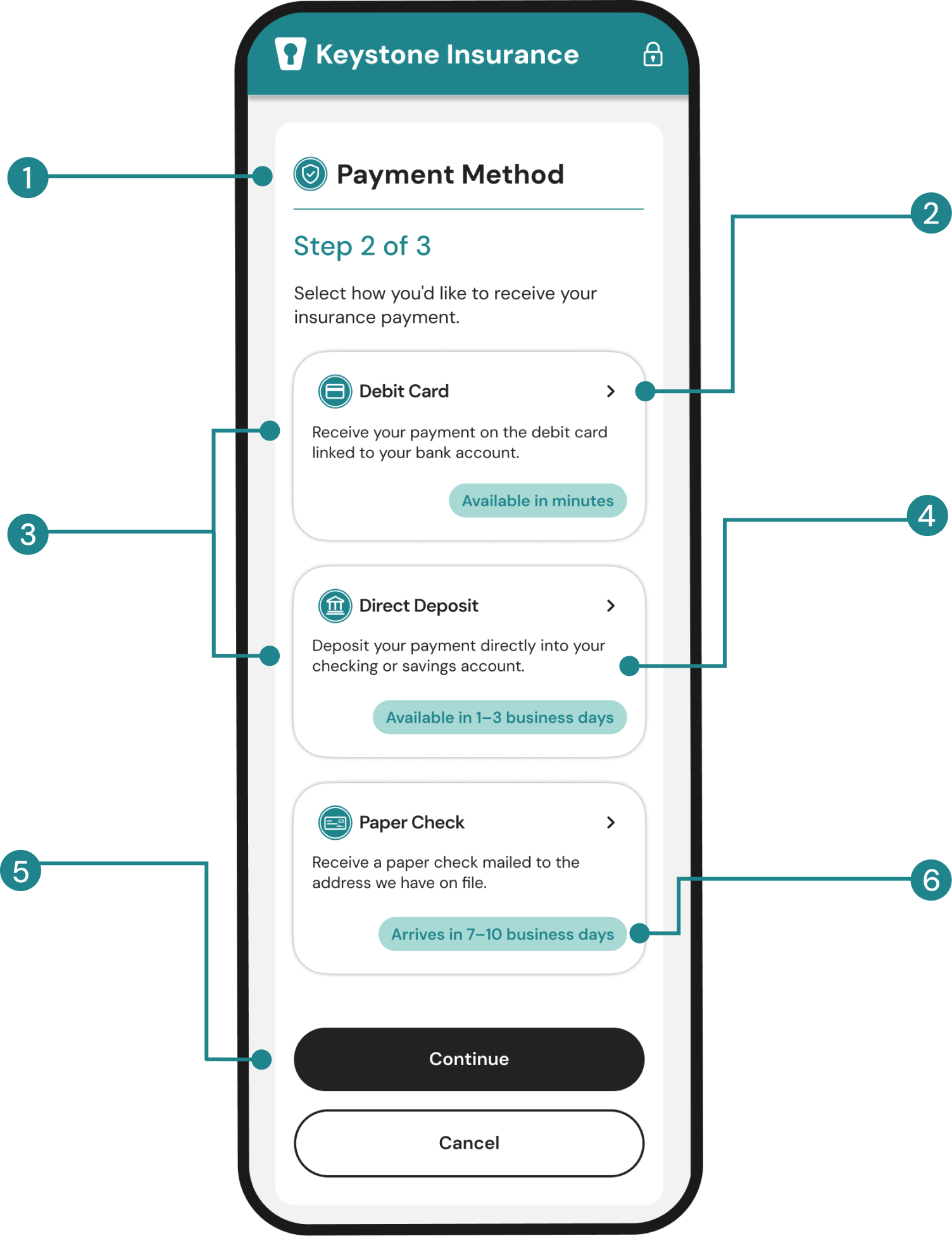
4.5.1 Contrast
Our color palette meets WCAG AA standards with sufficient contrast for text and interface elements.
Large Touch Targets
Button and interactive areas meet 44x44px minimum for touch accessibility.
Clear Hierarchy
Typography scale, spacing, and visual weight guide users through the content with ease.
Accessible Form Controls
Buttons, icons, and cards are built with accessible states, labels, and readable text for all users.
Keyboard Focus Order
Elements follow a logical tab order with visible focus states for easy keyboard navigation.
Supportive Content
Clear descriptions and timing information help users make informed choices.
Accessibility wasn't a final checklist. It shaped design decisions throughout the project, from interaction patterns to reusable components.
One Platform.
Configured for Every Client.
One shared platform supported multiple organizations through configuration rather than redesign. Branding, messaging, and payment options adapted to each client while the core experience remained consistent.
How the Platform Scalest
Shared Platform
Built once. Reused across every client.
Shared Components
Built once. Used everywhere.
Consistent Layouts
Reliable patterns across all clients.
Responsive Design
Works seamlessly on every device
Accessibility Standards
WCAG compliant for all users.
Secure Interactions
Validated, accessible, and built for trust.
Scalable Architecture.
One platform. Many organizations.
Client-Specific Configuration
Displayed throughout the experience.
Logo
Applied across the interface.
Brand Colors
Configured per client.
Payment Methods
Payment terminology adapts to each client.
Payment Copy
Based on payment rails and business rules.
Timing Messages
Configured for each client.
Contact Information
The result:
One secure platform that scales across organizations through configuration rather than redesign.
choppa.design

Where whimsy meets wireframes.
Contact

Digital Payout Experience
Creating a configurable payment experience that scales across multiple organizations.
Confidentiality Note
To protect confidentiality, branding and client details have been recreated for this portfolio. The work shown reflects my design process and contributions.
Goals
Business Goals
- Reduce paper check usage
- Increase digital payment adoption
- Support multiple organizations
Platform Goals
- Configurable • Accessible
- Responsive • Scalable

User Goals
- Receive payments faster
- Choose a preferred payment method
- Build trust through secure interactions
The Problem
Organizations needed a digital payment experience that felt simple for payees while remaining flexible enough to support different industries and business needs.
The challenge wasn't designing one payment flow. It was creating a scalable platform that could adapt to many organizations without sacrificing usability.
PAPER CHECKS
Slow • Expensive
- Inflexible



DIGITAL DISBURSEMENTS
Secure • Fast
• Flexible

Responsibilities

Lead UX
Visual Designer

Timeline
6 Months
Company
Huntington Bank

Team
PM, UX, Dev,
Accessibility
Platform
Responsive
Web Platform
Discovery & Planning
Mapping the Platform
We partnered with product and engineering to map a configurable payment platform that could support multiple organizations while maintaining one shared experience.
What We Learned
- One core journey supported multiple industries.
- Clear guidance mattered more than fewer steps.
- Configuration scaled better than customization.
Early Exploration
Early concepts explored different ways to guide users through payment selection while creating a flexible experience that could scale across multiple clients.
What We Explored:
- Information hierarchy
- Screen progression
- Payment selection patterns
- Responsive layouts
- Form organization
Although the final product evolved significantly, sketching early concepts helped validate the overall experience before building the design system.
Key Outcomes
- Simplified payment choices into guided, step-by-step decisions.
- Used progressive disclosure to reduce cognitive load.
- Refined layouts into a scalable platform pattern.
*Early concepts validated the overall flow before refining the final interaction patterns.
From Paper Checks to Digital Payments
Organizations could replace paper checks with a guided digital payment experience that remained consistent while adapting to each client's brand and business rules.
Guided Payment Flow
Designed one guided payment experience that could scale across organizations while remaining familiar and accessible.
User Journey:
Verify Identity
Select a Payment Method
Review & Confirm
Design Decisions
- Guided users through smaller, manageable steps.
- Used familiar payment patterns to build confidence.
- Reduced cognitive load with progressive disclosure.
Biggest Challenge
Designing a platform that could adapt to multiple industries without sacrificing usability.

What I’m Most Proud Of
Creating a scalable platform that supports multiple organizations through configuration instead of redesign.

What I Learned
Designing configurable products reinforced the importance of systems thinking and cross-functional collaboration.
Now experience it.
From research to a scalable platform, this project transformed digital payouts into a guided, configurable experience. Watch the prototype to see the final experience in action.
Follow Me
Email me
mciappa.art@gmail.com
©2026
Accessibility
Accessibility was considered from the beginning of the project, influencing interaction patterns, form design, navigation, and reusable components across the platform.
Designing
for Accessibility
Designed to meet WCAG 2.1 AA standards while creating an inclusive, usable experience.
All text and interface elements meet or exceed WCAG AA contrast requirements.
WCAG-Compliant Color Contrast
All interactive elements meet the 44x44px minimum for touch accessibility.
Large Touch Targets
Typography, spacing, and layout guide users through the content in a meaningful order.
Clear Visual Hierarchy
From fields, buttons, and icons include accessible labels, states, and error handling.
Accessible From Controls
Logical tab order and visible focus states ensure smooth navigation for keyboard users.
Keyboard Accessibility
Proper headings, landmarks, and ARIA best practices support assistive technologies.
Semantic Structure
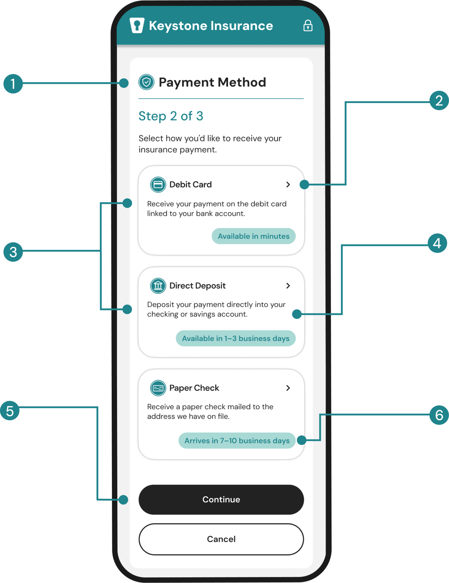
4.5.1 Contrast
Our color palette meets WCAG AA standards with sufficient contrast for text and interface elements.
Large Touch Targets
Button and interactive areas meet 44x44px minimum for touch accessibility.
Clear Hierarchy
Typography scale, spacing, and visual weight guide users through the content with ease.
Accessible Form Controls
Buttons, icons, and cards are built with accessible states, labels, and readable text for all users.
Keyboard Focus Order
Elements follow a logical tab order with visible focus states for easy keyboard navigation.
Supportive Content
Clear descriptions and timing information help users make informed choices.
Accessibility wasn't a final checklist. It shaped design decisions throughout the project, from interaction patterns to reusable components.
One Platform.
Configured for Every Client.
One shared platform supported multiple organizations through configuration rather than redesign. Branding, messaging, and payment options adapted to each client while the core experience remained consistent.
The result:
One secure platform that scales across organizations through configuration rather than redesign.
How the Platform Scalest
Shared Platform
Built once. Reused across every client.
Shared Components
Built once. Used everywhere.
Consistent Layouts
Reliable patterns across all clients.
Responsive Design
Works seamlessly on every device
Accessibility Standards
WCAG compliant for all users.
Secure Interactions
Validated, accessible, and built for trust.
Scalable Architecture.
One platform. Many organizations.
Client-Specific Configuration
Displayed throughout the experience.
Logo
Applied across the interface.
Brand Colors
Configured per client.
Payment Methods
Payment terminology adapts to each client.
Payment Copy
Based on payment rails and business rules.
Timing Messages
Configured for each client.
Contact Information