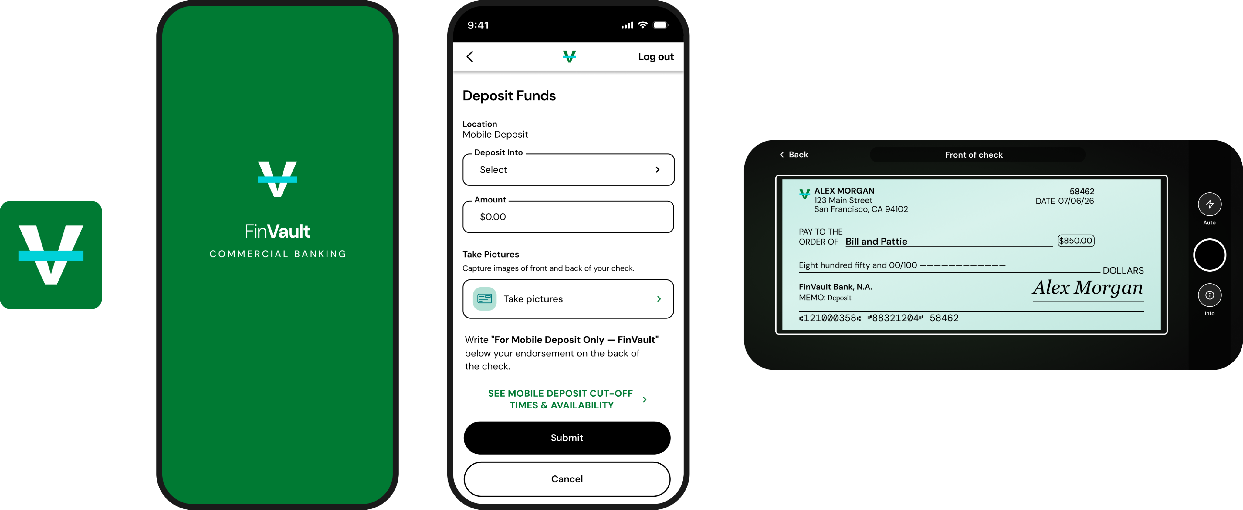
Commercial Remote Deposit Capture
Making commercial check deposits as simple on mobile as they were secure.
Project Overview
Commercial customers could already deposit checks remotely using desktop scanners. This project reimagined that workflow for mobile while preserving the security and compliance required in commercial banking.

Responsibilities
UX Strategy, Interaction Design, User Flows, Wireframing, Visual Design, Accessibility, Developer Collaboration
Official Role
Lead Visual Designer
Follow Me


Email me
mciappa.art@gmail.com
©2026
The Challenge
Commercial customers could only deposit checks using dedicated desktop hardware.
Our goal was to bring that experience to mobile while meeting commercial banking's security, accessibility, and compliance requirements.
Research & Discovery
Before designing the experience, Hinal and I spent time understanding both the business and the user experience.
We reviewed commercial banking requirements, explored how other banks approached mobile check capture, and identified opportunities to make the experience feel simpler and more intuitive.
Competitive
Analysis
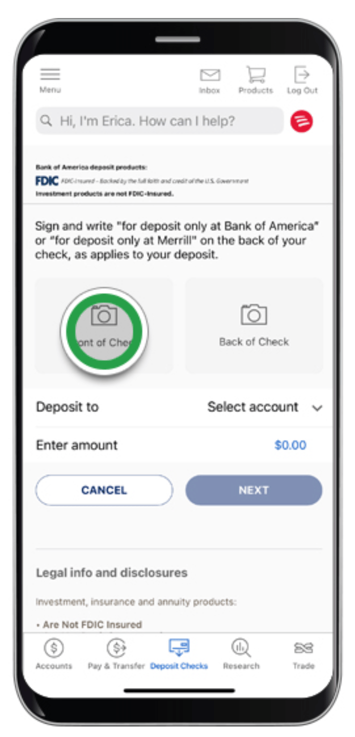
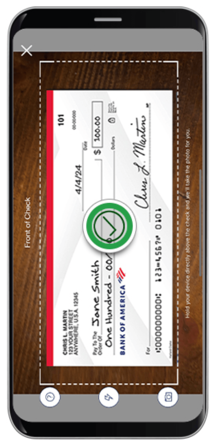
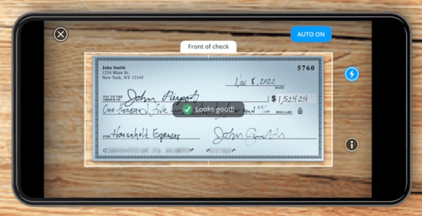
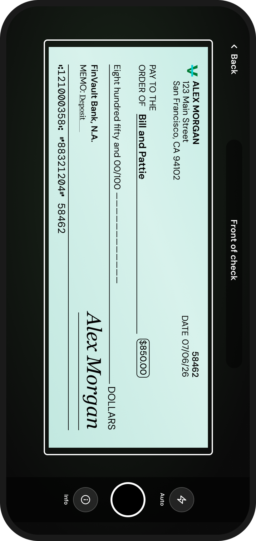
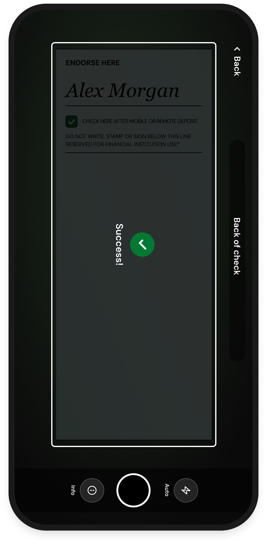
Camera guidance
Reduced confusion by helping users position checks correctly.
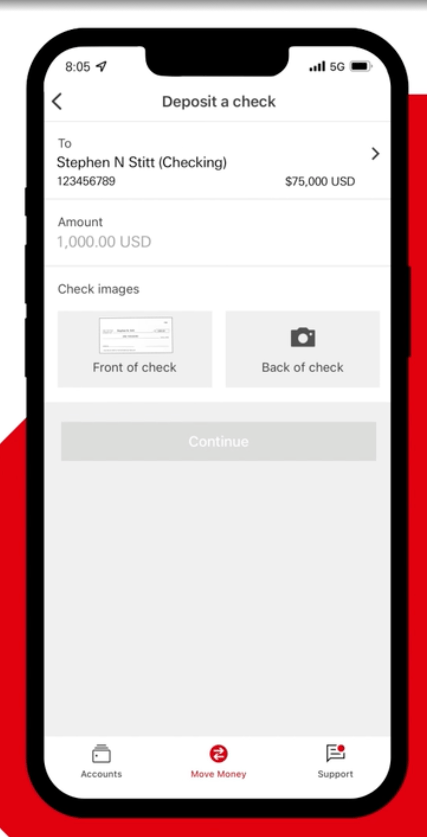
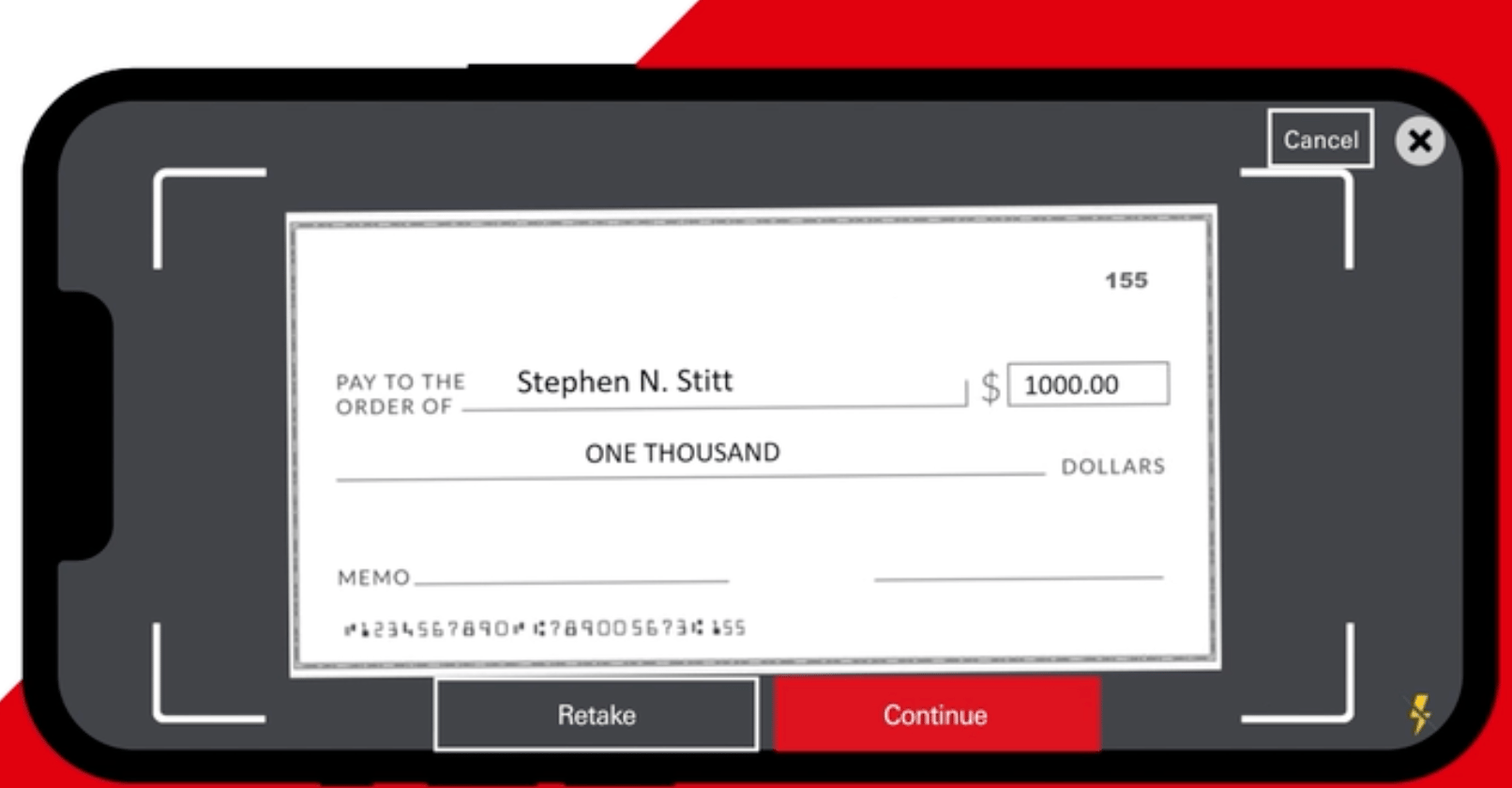
Progress visibility
Kept users informed throughout the deposit process.
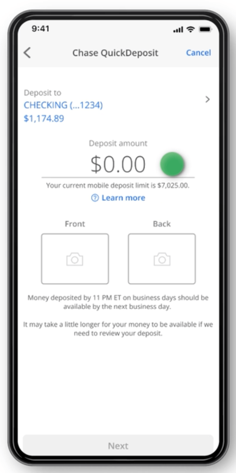
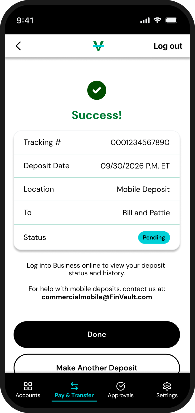
Clear confirmation
Provided reassurance that the deposit was successful.
What We Learned
What We Learned

Clear camera guidance helps users capture checks with confidence.

Simple workflows reduce cognitive load.

Helpful error messages improve recovery.

Transparent confirmations build trust.

Consistent patterns make complex tasks feel familiar.
Building the Experience
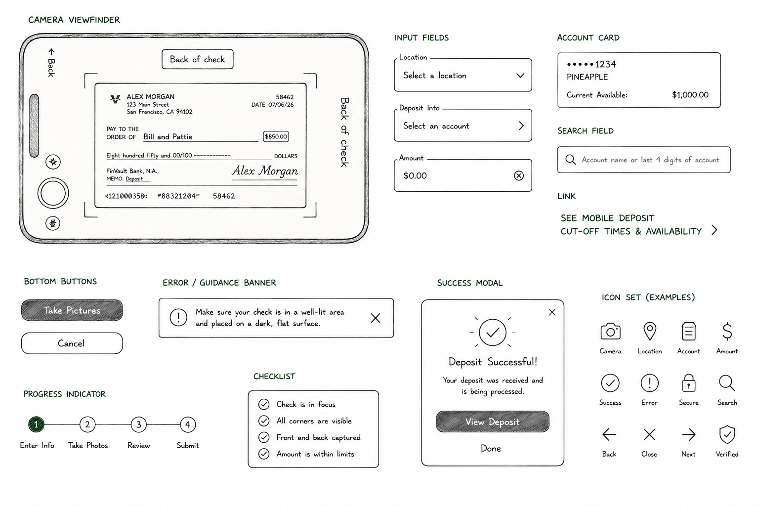
Every feature was built within Huntington's Commercial design system. Existing components were reused whenever possible, with new patterns introduced only when they improved the experience. This kept the product consistent, accessible, and ready for future enhancements.
- Accessibility was built into every interaction
- Reusable components ensured consistency across the experience.
- Patterns were designed to scale with future features.
Reflection
Biggest ChallengeDesigning a mobile deposit experience that balanced customer expectations, commercial banking requirements, accessibility, and fraud prevention.
What I LearnedComplex products succeed when designers, developers, product partners, and accessibility specialists work together from the beginning.
The Final Experience
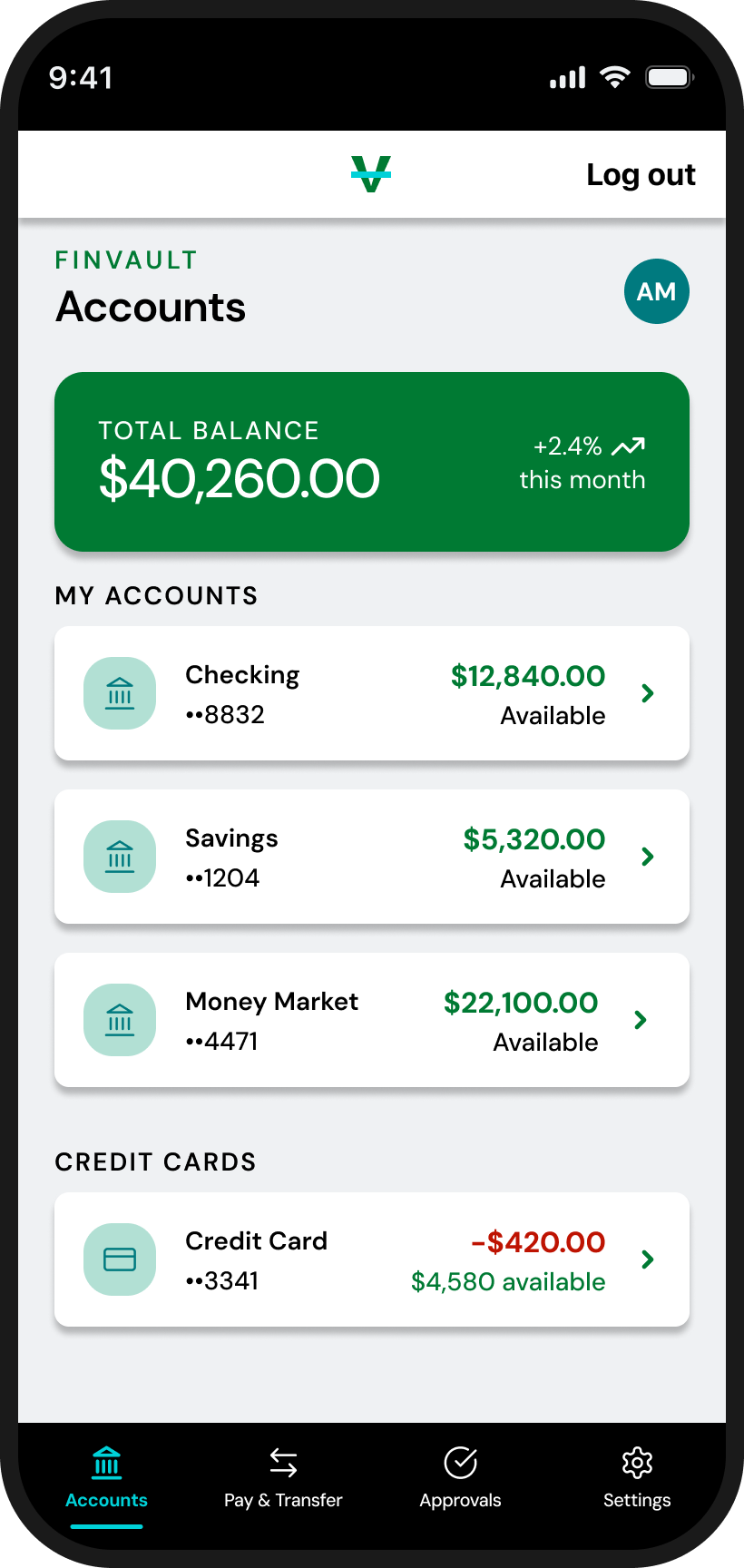
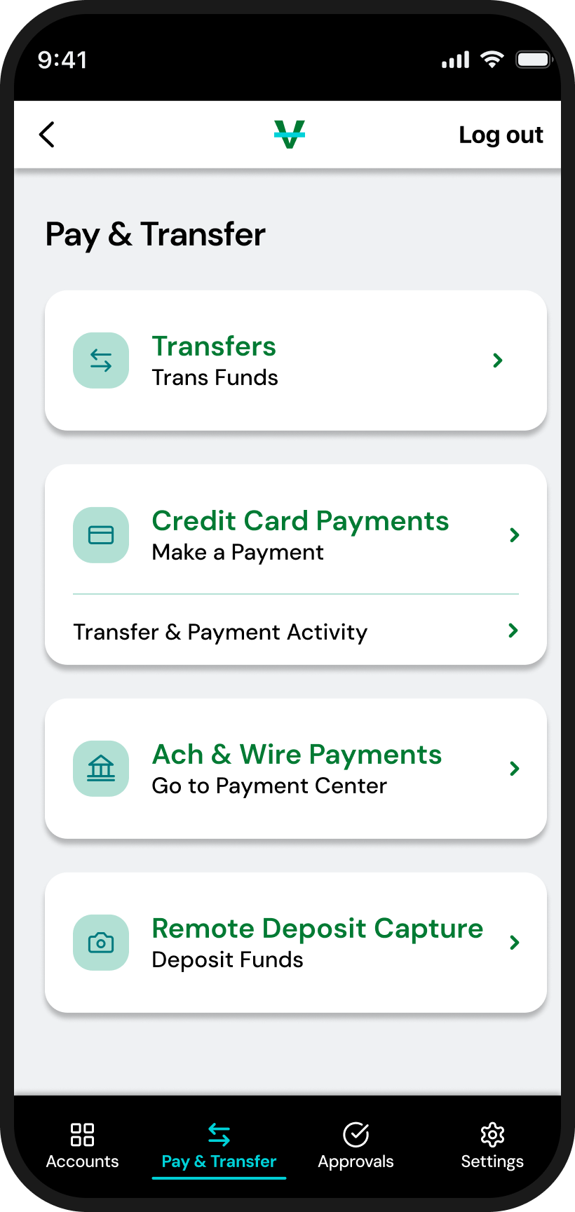
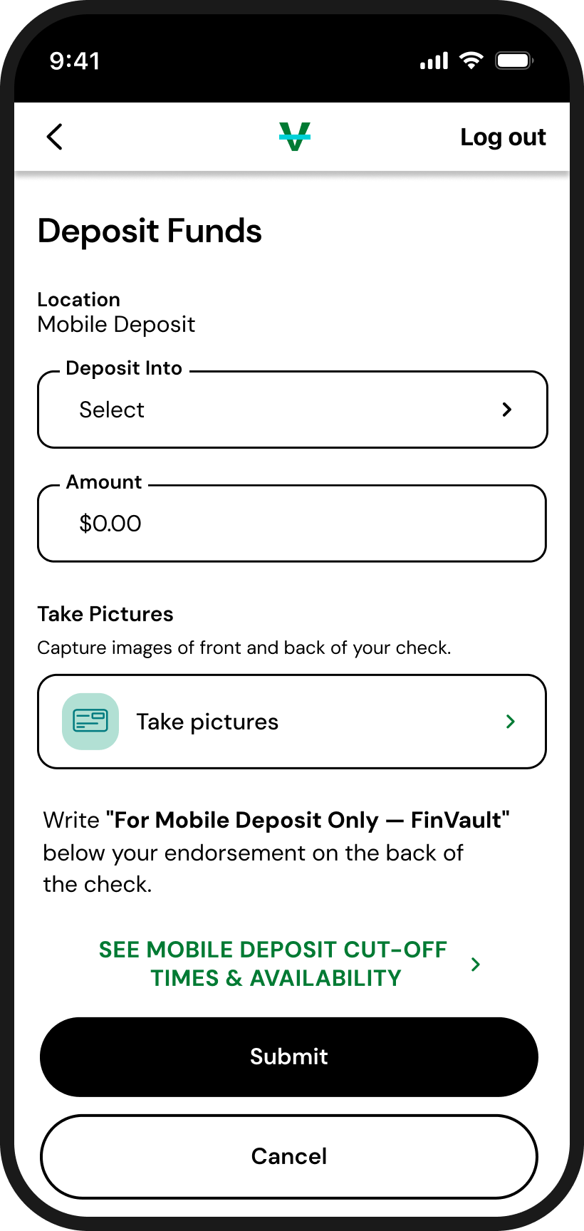
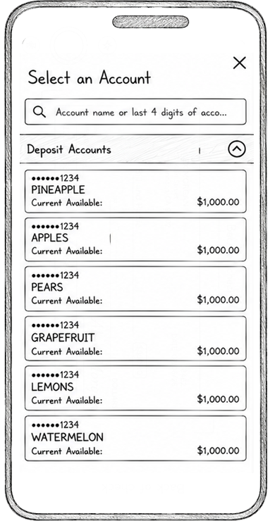
Hand-drawn sketches helped explore layouts before moving into high-fidelity designs. Throughout the project I partnered closely with developers, product, and accessibility specialists to refine the experience from concept through implementation.
Key Design Decisions
• Broke the deposit process into smaller, guided steps.
• Prioritized familiar patterns to reduce the learning curve.
• Built reusable components that could scale with future commercial features.
Designing the Experience
Hinal and I mapped the end-to-end flow and explored early concepts before moving into high-fidelity design. I led the final UI, interactive prototype, and motion design while working within Huntington's commercial design system.
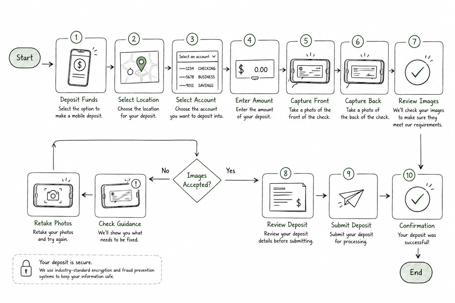
*Simplified the deposit flow by reducing unnecessary decisions.
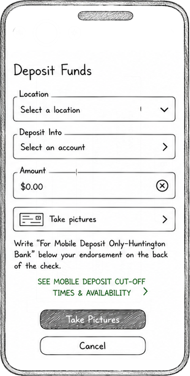
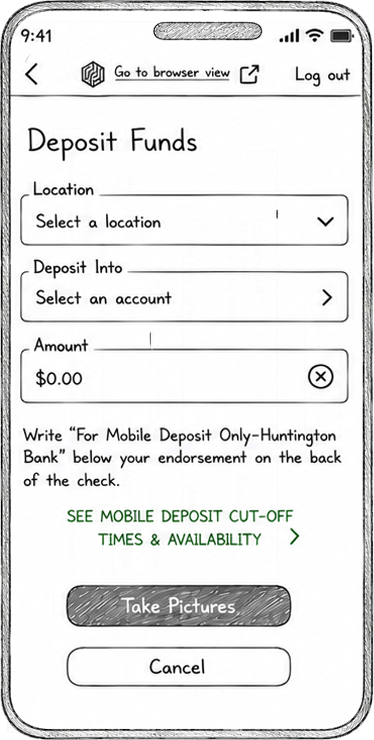
*Grouped related actions to create a more predictable experience.
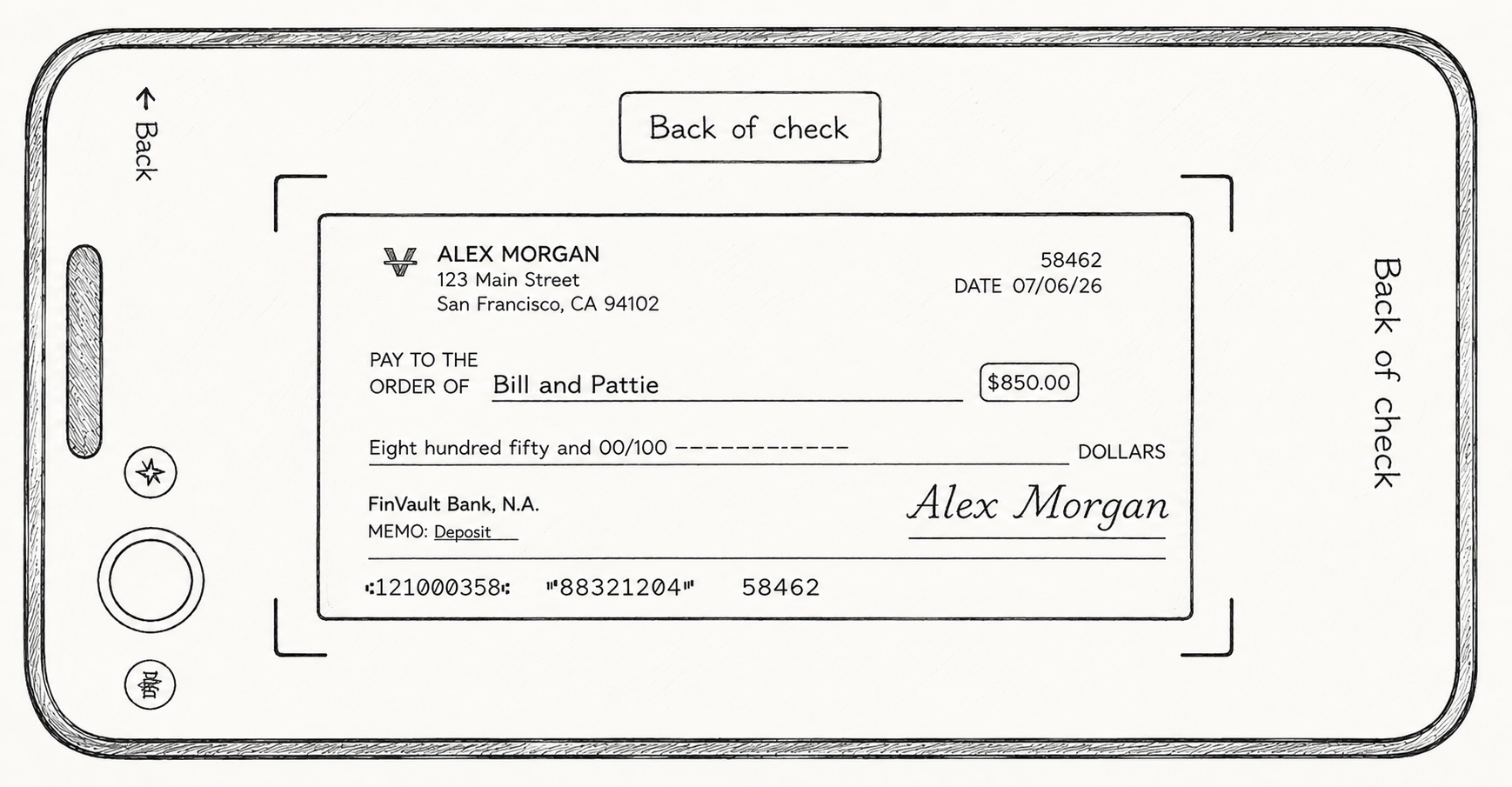
*Explored multiple layouts before selecting the final interaction.
choppa.design

Where whimsy meets wireframes.

Commercial Remote Deposit Capture
Making commercial check deposits as simple on mobile as they were secure.
Project Overview
Commercial customers could already deposit checks remotely using desktop scanners. This project reimagined that workflow for mobile while preserving the security and compliance required in commercial banking.
Responsibilities
UX Strategy, Interaction Design, User Flows, Wireframing, Visual Design, Accessibility, Developer Collaboration
Official Role
Lead Visual Designer
Follow Me
Email me
mciappa.art@gmail.com
©2026
The Challenge
Commercial customers could only deposit checks using dedicated desktop hardware.
Our goal was to bring that experience to mobile while meeting commercial banking's security, accessibility, and compliance requirements.
Research & Discovery
Before designing the experience, Hinal and I spent time understanding both the business and the user experience. We reviewed commercial banking requirements, explored how other banks approached mobile check capture, and identified opportunities to make the experience feel simpler and more intuitive.
Competitive Analysis
Camera guidance
Reduced confusion by helping users position checks correctly.
Progress visibility
Kept users informed throughout the deposit process.
Clear confirmation
Provided reassurance that the deposit was successful.
What We Learned
What We Learned
Clear camera guidance helps users capture checks with confidence.
Simple workflows reduce cognitive load.
Helpful error messages improve recovery.
Transparent confirmations build trust.
Consistent patterns make complex tasks feel familiar.
Designing the Experience
Hinal and I mapped the end-to-end flow and explored early concepts before moving into high-fidelity design. I led the final UI, interactive prototype, and motion design while working within Huntington's commercial design system.
*Simplified the deposit flow by reducing unnecessary decisions.
*Grouped related actions to create a more predictable experience.
*Explored multiple layouts before selecting the final interaction.
Building the Experience
Every feature was built within Huntington's Commercial design system. Existing components were reused whenever possible, with new patterns introduced only when they improved the experience. This kept the product consistent, accessible, and ready for future enhancements.
- Accessibility was built into every interaction
- Reusable components ensured consistency across the experience.
- Patterns were designed to scale with future features.
Reflection
Biggest ChallengeDesigning a mobile deposit experience that balanced customer expectations, commercial banking requirements, accessibility, and fraud prevention.
What I LearnedComplex products succeed when designers, developers, product partners, and accessibility specialists work together from the beginning.

Designing For Scale
Designing For Scale

The Final Experience
Hand-drawn sketches helped explore layouts before moving into high-fidelity designs. Throughout the project I partnered closely with developers, product, and accessibility specialists to refine the experience from concept through implementation.
Key Design Decisions
• Broke the deposit process into smaller, guided steps.
• Prioritized familiar patterns to reduce the learning curve.
• Built reusable components that could scale with future commercial features.
choppa.design

Where whimsy meets wireframes.
Contact

Commercial Remote Deposit Capture
Making commercial check deposits as simple on mobile as they were secure.
Commercial Banking | Mobile App | Product Design
Project Overview
Commercial customers could already deposit checks remotely using desktop scanners. This project reimagined that workflow for mobile while preserving the security and compliance required in commercial banking.
Responsibilities
UX Strategy Interaction Design User Flows Wireframing Visual Design Accessibility Developer Collaboration
Official Role
Lead Visual Designer
Follow Me
Email me
mciappa.art@gmail.com
©2026
The Challenge
Commercial customers could only deposit checks using dedicated desktop hardware. Our goal was to bring that experience to mobile while meeting commercial banking's security, accessibility, and compliance requirements.
Research & Discovery
Before designing the experience, Hinal and I spent time understanding both the business and the user experience. We reviewed commercial banking requirements, explored how other banks approached mobile check capture, and identified opportunities to make the experience feel simpler and more intuitive.
Competitive Analysis
Camera guidance
Reduced confusion by helping users position checks correctly.
Progress visibility
Kept users informed throughout the deposit process.
Clear confirmation
Provided reassurance that the deposit was successful.
What We Learned
Clear camera guidance helps users capture checks with confidence.
Simple workflows reduce cognitive load.
Helpful error messages improve recovery.
Transparent confirmations build trust.
Consistent patterns make complex tasks feel familiar.
*Simplified the deposit flow by reducing unnecessary decisions.
Designing the Experience
Hinal and I mapped the end-to-end flow and explored early concepts before moving into high-fidelity design. I led the final UI, interactive prototype, and motion design while working within Huntington's commercial design system.
*Explored multiple layouts before selecting the final interaction.
*Grouped related actions to create a more predictable experience.
Building the Experience
Every feature was built within Huntington's Commercial design system. Existing components were reused whenever possible, with new patterns introduced only when they improved the experience. This kept the product consistent, accessible, and ready for future enhancements.
- Accessibility was built into every interaction
- Reusable components ensured consistency across the experience.
- Patterns were designed to scale with future features.

Reflection
Biggest ChallengeDesigning a mobile deposit experience that balanced customer expectations, commercial banking requirements, accessibility, and fraud prevention.
What I LearnedComplex products succeed when designers, developers, product partners, and accessibility specialists work together from the beginning.
Designing For Scale
Designing For Scale
The Final Experience
Hand-drawn sketches helped explore layouts before moving into high-fidelity designs. Throughout the project I partnered closely with developers, product, and accessibility specialists to refine the experience from concept through implementation.
Key Design Decisions
• Broke the deposit process into smaller, guided steps.
• Prioritized familiar patterns to reduce the learning curve.
• Built reusable components that could scale with future commercial features.